
 Kidimo is a new shop online that sells vintage shop signs.
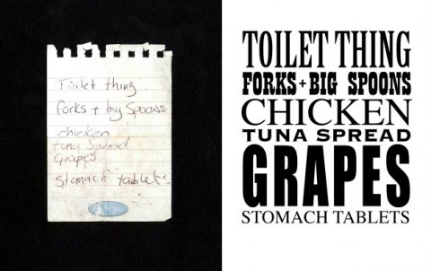
Wednesday, October 21, 2009
Friday, October 16, 2009
Even Hitler flips on shitty fonts
 You have most likely seen one of the many hilariously subtitled versions of the movie, Downfall, where Adolf Hitler goes on a rant in German. This latest version looks at what happens when the subtitle guy gets a CD with 500 cheap fonts. (via quipsologies)
Monday, October 5, 2009
An ode to the @ and the ampersand
Richard Wilbur, “&”
From The Beautiful Changes and Other Poems (1947):
A slopeshouldered shape from scurrying burdens
Backward and forth, or perhaps a lyre
Or a clef wrung wry in tuning untunable tones
Or a knot for tugging an out-of-hand.
Vine to the trellis in clerical gardens:
Sweetness & light, ice & fire,
Nature & art have dissocketed all your bones,
Porter, poor pander ampersand. (via The Ampersand)
@
Like the whorl of an out-of-this-world ear that had been lent
to an oak-gall wasp by a tenth century Irish monk
who would hold out oak-gall ink against the predicament
in which he found himself…
Like the ever-unfolding trunk
of the elephant in the room that gives such a bad vibe
it vies with your old hippie girlfriend who once lent such weight
to any argument to which you feared she might subscribe,
including her insistence we abbreviate
our most promising rlshps…
Like the scrolled-down tail
of a Capuchin monkey drawing on its inner strengths
as it hammers short-sighted snail against short-sighted snail
that has nonetheless gone to extraordinary lengths…
Like the tapeworm swallowed by a hippie who was once fat
but is now kind of bummed out you've lost track of where she's at. (via Design Observer)

Thursday, October 1, 2009
Friends of Type

New blog, Friends of Type, a “a sketchbook, an archive, a dialogue” about, yup, type. (via Quipsologies)
So you think you can tell Helvetica from Arial?
 David Friedman took 20 Helvetica logos, redid them in Arial (blasphemy!), and made aquiz out of it to help people hone their ability to differentiate them in a hands-on way. (via swissmiss)
Subscribe to:
Posts (Atom)