
 From Joe Stewart's flickr.
Friday, February 27, 2009
Typographic tree sculpture
 The striking, cracked trees, 14 in all, are situated throughout the library building and are installed vertically, flush to the floor and ceiling to resemble supporting, structural pillars. Each tree is, in fact, a real oak trunk and displays carved passages of text from literature within the library, the typeface of each passage chosen carefully to suit the nature of the text.
Thursday, February 26, 2009
Megan is a font designer
 Megan Corkrey in this season's American Idol is a 23-year-old font designer from Utah.
Space, the final font tier

KERN is a minimalist typography experience challenging you to precisely place a missing letter into a falling word while avoiding any unnecessary ligatures!

Township typography
 This is it. I'm gonna go out these weekends and take pictures of Kuala Lumpur shop fronts. Township Typography, a collection of South African signage. (via Quipsologies)
Wednesday, February 25, 2009

Complot Creativity School: H, D, Y
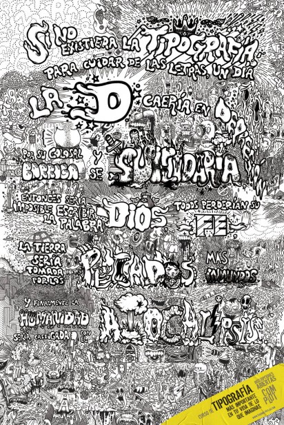
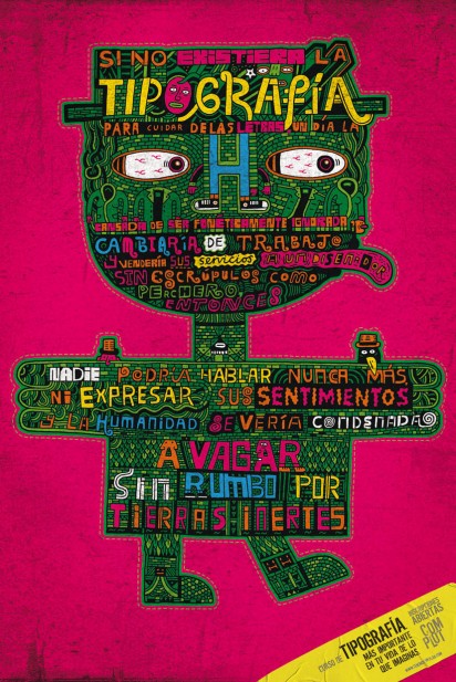

Typography course. More important in your life than you can imagine. Registration open.
Complot Creativity School.
Advertising Agency: Contrapunto BBDO, Barcelona, Spain
Creative Director: Tomas Oliva, Carlos De Javier
Art Director: Lucas Jatobá
Copywriter: Emma Piquer
Illustrator: Serge Seidlitz (H), Diego Medina (D), Open the Door (Y) (via ibelieveinadv)
Tuesday, February 24, 2009

Criterion Box Art


"For film nerds like myself, the Criterion Collection is the crème de la crème. Every title in their incredible catalog is restored to pristine picture and sound quality and usually boasts some of the best bonus features out there.
But what is really seals the deal is Criterion’s gorgeous box art. Every DVD in the Criterion Collection sports a completely original box art design. They must have some of the best in-house designers working today as their DVD packaging just can’t be beat. Needless to say, this makes it especially hard for the DVD collector to resist."
I promise
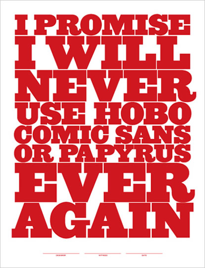 Jeff Matz Designer/Principal of Lure Design created this last week for a screen printing presentation at “Pull + Ink” Art Center of South Florida, South Beach for AIGA Miami. They were such a big hit - they decided to put them up for sale! (via swissmiss)
Monday, February 23, 2009


Wednesday, February 18, 2009
Lumen invitation
 Theis & Khan Architects designed a new mulit-faith center for worship in London called Lumen, The central feture within Lumen is the 'Shaft of Light' - an etherial, white rendered space which emulates a beam of light, holding a prayer room inside. It was this focus on rays of light which inspired the invitation design for the Lumen opening in late 2008.
Tuesday, February 17, 2009
Film books covers
Aside from the fact that the article is brilliantly written itself, I just love seeing these retro book covers on films & movies accompanying the post.


Store Front: The Disappearing Face of New York
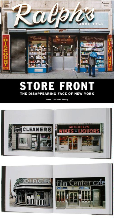 Finally someone captured these beautiful storefronts with insanely gorgeous typography before they are gone. Store Front: The Disappearing Face of New York (via swissmiss). In another side of the world, London Shop Fronts. Malaysians, we need to photograph storefronts around our local area too, don't you think?
Thursday, February 12, 2009
Montreal in a Nutshell
Stop Motion: Montreal in a nutshell from Sylvain Dumais on Vimeo.
Stop motion video shot for Montreal agency Sidlee. This video was made to showcase Montreal as a creative hub. (via notcot)
How to Disappear Completely and Never Be Found
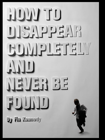
Poster for the play How to Disappear Completely and Never Be Found. This was made by hand cutting, stacking, and kerning thousands of paper letters.
By Thomas Bradley, who happens to have one of the most amusing about pages around. (via Book Cover Archive blog via HELLO BAULDOFF)
Wednesday, February 11, 2009
Tuesday, February 10, 2009
Moleskine Helvetica
 I will love you for life if you get me one of this (or let me know where I can get this!) (via twittering fridaysdust)
Monday, February 9, 2009
Rob Moxon tees
 How awesome are these tees from Rob Moxon? FYI, he's also in the midst of seeking work placements in and around UK. (via FormFiftyFive)


Friday, February 6, 2009

Journal of Urban Typography
 Not sure if this has been featured here, but here it is: Journal of Urban Typography. Just because I like going out and take pictures of random signboards that intrigued me.
Wednesday, February 4, 2009
This is Agostina
This is Agostina from YouWorkForThem on Vimeo.
“This is Agostina” is a video to promote the font Agostina which was designed by Michael Cina. (via swissmiss)
Tuesday, February 3, 2009

Subscribe to:
Posts (Atom)